Week 11: Digital Tools in Public History

This week’s readings (http://chnm.gmu.edu/essays-on-history-new-media/essays/?essayid=47http://www.lotfortynine.org/2012/11/getting-to-the-stuff-digital-cultural-heritage-collections-absence-and-memory/http://www.historians.org/publications-and-directories/perspectives-on-history/november-2013/material-culture-in-the-digital-frame/artifacts-as-pixels-pixels-as-artifacts)  are again an extension of the discussion we’ve been having over the last couple of weeks on digitization of museum and archives collections.

As I’ve stated before, I am very much in favor of digitization and making collections more accessible online.  I feel though that the Sheila Brennan/T. Mills Kelly articles lack a real-world perspective.  The articles find fault in the efforts history museums have made in making their collections available online and creating a more interactive online experience.   The real problem lies with a lack of resources  – time, money and labor.  The majority of history museums are small and local and often run by volunteers or only a small staff.  The staff often have limited web expertise and they learn as they go with online projects.    The task of digitizing actual documents and photographs often falls to interns and volunteers.   Adding records for objects and attaching all relevant data usually falls to the staff.  And then it all needs to be uploaded to the website or database  – yet another task for the staff or perhaps that gets outsourced to a computer professional (which, of course, costs money).  Databases and websites need to be monitored and updated as well.   So digitization becomes a huge task with a lot of costs  – it definitely has benefits for the museum  but it can be quite difficult for a museum (of any size) to start this project and keep it up.

Martha Sandweiss points out some real drawbacks to digitization and how it creates a certain gap of understanding of the artifact.  The digitization process takes the artifact further out of context.  Often there is not substitute for the researcher or the museum visitor for seeing and sometimes handling an artifact in person.  There is no substitute for being able to stand next to a painting that is so large, you almost feel a part of it or to examine a document or object and see all the details and nuances.  (One of the perks of working in collections management is getting to working with “the stuff” and I’ve been so privileged to see and handle some incredible things.  The experience of handling an object that once belonged to Robert E. Lee is far removed to looking at a digitized photo of it!)

While digitization certainly helps increase access to collections and artifacts, museums need to strike a balance of their online presence and content and their in-person, in-house programming and experiences and the digital history community needs to understand that.
Week Ten: Digital Collecting and Preservation

Happy Archives Month!!!

For me, this week’s readings  (http://chnm.gmu.edu/digitalhistory/collecting/ ,http://quod.lib.umich.edu/d/dh/12172434.0001.001/1:4/–hacking-the-academy-new-approaches-to-scholarship?g=dculture;rgn=div1;view=fulltext;xc=1#4.7)  are a continuation of last week’s readings and discussion about digital humanities.

This week however really emphasizes the importance of archivists.  I have several friends who are archivists and I am fascinated by what they do, but I am more happy to benefit from their expertise while I work more with objects.  Recently, I have been guest curating an exhibit for the Baltimore Museum of Industry and have worked closely with their archivist to gather photos and background information.   It’s been a great collaborative experience – he’s helped me find (and choose) some great photographs and has steered me towards sources of information needed.    Working with him has helped develop my own research skills.

I came across this post today from the Smithsonian about their “Ask an Archivist” Day. http://siarchives.si.edu/blog/ask-and-archivist-bring-your-questions-monday-october-27 I find the descriptions of the different kinds of archivists there to be quite interesting and am glad to see the Smithsonian dedicating some of their efforts to preserving their own digitally-born history.   I also find it interesting that this whole “event” occurs solely on their Facebook page.  It’s very informative and apropos to our discussions this week.

Now go out and thank an archivist!!!

week 9: The future of digital history and scholarship

The reading from Daniel Cohen and Roy Rosenzweig http://chnm.gmu.edu/digitalhistory/digitizing/ in particular resonated with me.   I started volunteering and working in the museum field about 7 years ago and one of the things I have noticed is the push for museums to digitize their collections and make them available online.   At the very minimum most museums are expected to have a web site with a  link to information about their collection highlights.   Expectations are now leaning towards museums providing a link to a searchable database of at least part of their collection.

I have done some work in posting select collection objects to a searchable portal and it’s not easy.  There were issues with the compatibility of the collections software the museum used, the online portal, and editing the amount of information that was sent to the portal.  Ultimately, it didn’t happen.  The museum board assumed it could be done easily so no real plan was made and eventually the project was dropped.  But I have been at other museums where the effort to digitize has been successful and is ongoing.   The response from the public  and researchers has been very enthusiastic and requests for copies of photographs and other images is a good source of revenue for the museum.

I know that many museums had concerns in the beginning that digitizing and making images of their collections available online would decrease their visitation – in truth, it has actually helped increase visitation as people are more curious about the museum and want to see the actual object(s) they saw online.   I think it’s definitely the path that museums and other public institutions not just should take, but MUST take in order to attract more attention to themselves and attract researchers and visitors.

Free access….

This week’s readings were from Chapter 3 of Gary Hall’s book Digitize This! The Politics of New Media and Why We Need Open Access Now and Chapter 3 of John Willinsky’s book The Case for Open Access to Research and Scholarship.  Both authors write about how copyright laws have skewed in favor of copyright holders (often big corporations) interests and against the public interest and fair use.  Both discuss and advocate for free online access to scholarly works.  Hall advocates for his site CSeARCH which does provide for free access to research in the cultural studies field.  Research can be submitted, edited, added to, linked to other relevant material and is available at any time to anyone with internet access.  Willinsky focuses more on how scholarly journal publishers obtain copyrights from authors in exchange for peer review and publication and then charge fairly high fees for access to these journals which, of course, limits access to only those who can pay.  Both make the point that research shows that research and articles make available through open access increase the numbers of readers  and citations of the works.

I understand the frustration of being unable to access information in scholarly journals.  Several times I have times I’ve found articles I wanted to use either for school or personal use but when faced with having to cough up 20 bucks I always refused. (Even when I used the school’s access to the databases – not every journal is available).  I can buy a hard cover book for $20 and I can look through it before I buy it, so I’m not going to pay that much for a 10-20 page article I can’t even preview!  Any student/interested person who doesn’t somehow have free access is pretty much out of luck.  It would be prohibitively expensive for most people to buy enough articles for proper research much less for access to the online databases.

However, this raises two issues for me:

  • One of the benefits of the scholarly journals is peer review but are the open access site submissions reviewed in any way? This takes us back to the beginning of the semester and our discussion about how to differentiate between good and back information online.
  • Free and open access is an admirable and I am all for making more information available to a greater audience but there are costs involved for the publishers even for online material. So why should the publishers be expected to provide access for free?

I don’t have offer any solutions, I’m just wondering….

Week 7: Copyright, free culture and copyleft

I really had to take some time to think about this week’s readings from Lawrence Lessig’s book Free Culture  http://www.free-culture.cc/freeculture.pdf (specifically the Preface, Introduction, and chapters 1, 7 and 10). I honestly didn’t understand his point at first but think I do now.  Rather than go through his somewhat lengthy and complicated theory of the forms of regulation upon an entity and the shift in balance among them, I’d like to discuss his point about restriction of creativity.

In essence, Lessig claims that creators have always drawn from and built on the ideas and creations of those that came before them.  I completely agree.  Whether you agree with those older ideas, want to reinterpret or want to completely negate them, new ideas built on old ones.  You never know where a bit of inspiration is going to come from and often in retrospect you might not even remember exactly what it was the stoked your imagination – only that you had been inspired.  Lessig further argues that free cultures leave a great deal available for others in the future to be inspired by and build upon.  Essentially, when we restrict the ability to be inspired, then we restrict creativity.

The Constitution provided adequate protections for creators in the form of copyrights but more recent law had changed how those copyrights are created and greatly extended their length.  Lessig argues that these extensions unfairly hamper creativity.  He fully believes in granting protections to creators (I in all honestly thought he didn’t at first!), but only for a limited time.  After finishing the assigned readings from his book, I’ve come to better understand his point.  I think these changes to copyright law only increase the fear of being sued and limit the ability of others to be inspired and to think and to create.

          All this doesn’t just apply to movies or music or works of fictions, it also has relevance to the work of historians.  There’s creativity in non-fiction and critical thought too.  An interest in a particular subject can be (and I think usually is) but another person’s research and writing on that subject.  But it would be ludicrous to limit new thought, approaches, research and writing on a subject to the first person who showed an interest or until that person was finished with the subject.  It would greatly limit, if not eliminate, new thought and knowledge along with creativity.  And that I think is a good part of what Lessig is worried about.

PastPerfect Software review

PastPerfect Software Evaluation Version

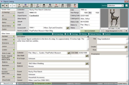
Many museums now use some sort of database program to manage the cataloging of their collections.  Anyone in a museum job that works with collections such as a registrar, collections manager, archivist, curator, etc. needs to be able to use a collections database.  PastPerfect Software is one of the most popular collections databases currently in use.

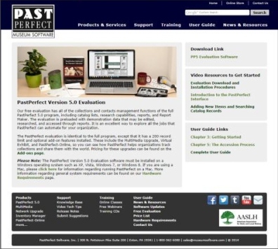
PastPerfect offers a free evaluation version of their program that can be downloaded from their website http://museumsoftware.com  under the Products & Services tab.   The same page provides links to video resources on their Youtube channel and links to their complete user guide.

PastPerfect Evaluation Version download page

Using the free evaluation version with the videos and the user guide is an excellent method for learning how to use a collections database and learning about the process of accessioning (formally bringing in) items into a museum collection.


Pros: PastPerfect Evaluation Version is essentially the same of their full version but limited to about 200 records and does not include any of the optional add-ins such PastPerfect online or Inventory Manager.

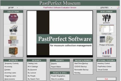
PastPerfect home page


The three videos listed on the evaluation download page will provide the basics on how to navigate through PastPerfect, add catalog records and conduct searches.  Other videos available through their Youtube channel provide additional information on how to conduct more in-depth searches, use the lexicon/Nomenclature 3.0 and highlight some of the optional features of the full version.
Version 5 bases its lexicon for naming for items on Chenhall’s Revised Nomenclature 3.0 which is the standard system used by museums and archives to assign the proper names to items, so it’s a good method for becoming familiar with nomenclature.

PastPerfect catalog record

The entire User Guide can be downloaded as PDFs and it is possible to learn how to use all of PastPerfect by going through the User Guide chapter by chapter.

Tutorials on CD on “Cataloging Collections”, “Research and Reporting” and “Managing Contacts, Donations and Membership” are available for $39 each or $110 for all three which also includes the user guide.  This would be a good investment for someone who is serious about learning this skill.

PastPerfect has excellent and helpful customer service for anyone who has bought one of their products.

Cons: Because PastPerfect is so comprehensive, it can seem like a daunting task to learn how to use it.  Having more tutorials available on the YouTube channel on how to use the software would be nice, but they also want people to buy their products so they can’t make everything free.

The search, research and report features are very good but the learning curve is fairly steep with each.  Working through the tutorials on these sections is especially recommended.

I would highly recommend that anyone who is interested in working in a museum  job that works with collections items download the free evaluation version of PastPerfect and take some time to familiarize themselves with it.  Museum interns often spend a lot of time working on cataloging and knowing how to use a collections database will be a good skill to list on a resume when applying for internships.


Make a plan!

This week’s reading from Jeremy Boggs,  http://clioweb.org/2008/06/04/part-three-design-process/, and Brian Miller , Introduction and chapters 1-3 in Above the Fold: Understanding the Principles of Successful Web Site Design, address design principles and guidelines.

Boggs’ article covers the process of researching, developing and creating the design of a web site.  He employs a rather methodical approach of working through the process from brainstorming and doing research, to creating a concept, and then creating a mockup.  I particularly like his advice to develop a concept in response to a specific problem. That concept will inform every design choice and will help in explaining those choices to other members of the project team, the boss or the client.  His other advice about preparing a brief; understanding the need to choose options that provide the best solutions over one’s favorite options; and being diplomatic and positive with feedback is really good advice in general for anyone working on a project.

The chapters from Miller’s book cover some of the technical restraints of web design and standards of good layout.  He also stresses the importance of making a plan and having backup choices in case preferred options are not possible, which is also good advice for someone working on a project.

For me, this all points to the importance of making a plan.  You need to know what you want to do and what problems you need to address in order to make informed choices that solve those problems.   When it comes to the design of my blog, I’ll admit I didn’t have any sort of plan.  In something of a panic, I chose a design that I found visually appealing and looked easy to work with.  But I’m finding that it’s a design that doesn’t work all that well.  I want to change the header to include the ‘log in’ rather than having to scroll through all the blog posts to find it at the bottom.  I’ll add a sidebar with a table of contents.  I’d like to have each post on a different page if possible, rather than having to scroll through all of them. And I need to find a different font and font size to put more of each post onto the screen and makes it more readable. These are changes that are not possible in my current blog template, so I’m going to have to find a new one that lets me make more choices and addresses these needs.

PowerPoint, evidence, visualization and charts (I’m just annoyed…)

This week’s reading covered Edward Tufte’s critique of PowerPoint, his warning about charts, tables and graphs and Ben Schmidt’s analysis of history dissertations.  In a nutshell, Tufte HATES PowerPoint.  In  Beautiful Evidence, he says it is presenter oriented not audience oriented.  It reduces information to bullet points and limits the amount of text/charts/graphs that can be put onto each slide.  That means that information gets broken up and makes it more difficult to analyze.  He states “…it harms the quality of thought for producers and consumers of information.”    In PowerPoint presentations, information appears and disappears quickly making it difficult to follow the trail of the presenter’s reasoning and for the audience to do their own reasoning.  It reduces arguments to lists which leave out details, narratives and relationships.  He argues that a written report, printed out for each attendee (he refers mostly to meetings, not necessarily conferences) contains the most detail and information, is easier to follow and allows each person to take the information with when he/she leaves.   In Visualizing Evidence, Tufte uses the incident of a cholera outbreak in an area of London in 1854 to illustrate a point about charts and graphs.   Cholera is transmitted via infected water but before this outbreak it had been believed to be transmitted by air.  A physician tracked the cause of the outbreak to a particular well pump and convinced the London city council to cut off access to that well.   The cases of cholera dropped dramatically and returned to normal levels.  Charts showing the number of cases by week seemed to point to stopping access to the well as the main reason for the end of the outbreak.   But reading the full report from the doctor showed that other factors such as reduced population (many people had left the area by the time access was cut off, so a reduced population would also account for fewer cases) might account for the break in the epidemic although cutting off access probably helped prevent a recurrence of the cholera.  The point is that charts and graphs and tables contain limited information and that information can be easily manipulated depending on how it is grouped, so Tufte says it’s best to assume that any charts/graphs/tables that appear in a presentation are the best of all the possible results chosen expressly to advance the presenter’s case.

Ben Schmidt’s articles are about his inquiry into what years historians write about the most and what years are turning points in history.   He looked at American history dissertations submitted over a 120 year period and looked at the years included in the titles to see which time periods were most written about .  In his graphs, he found spikes at the years of the Civil War and the two World Wars (not really a surprise).  In his next analysis, he made an assumption that writers would pick years with round numbers – ending in either zero or five and then assigned a variable to years that ended in other numbers.  He then graphed the results showing spikes for certain years and how they should up more times than might be expected based in his assumption.  The years that coincided with big historical events popped up more often (what a surprise!)

Frankly, I’m annoyed!  I do agree with Tufte about being skeptical of charts, etc.  It’s far too easy to manipulate the data to make it fit a predetermined conclusion.  Also, his points about PowerPoint are well-made – it is a fairly inflexible format with a limited ability to convey technical or complicated information, BUT it is (in my opinion) incumbent upon the presenter to choose the method that best conveys all the information necessary and shame of people on those fields that rely on complicated and technical information for choosing a method that isn’t up to the task.    As for Ben Schmidt’s “investigation” – it seems pointless to me.  Historical events/periods/eras, etc don’t conform to nice, neat sets of time.  It seems logical to me that years associated with significant events are, of course, go to show up more often in dissertations than those that don’t.  His scope of inquiry was rather limited as he only choose dissertations with numbers in the title (what percentage of the whole is that?) and his assumptions of what years would be chosen is absurd.  I think he was just wasting time and trying to put off working of his own dissertation.  So between Tufte’s diatribe and Schmidt’s pointless charts, I’m just annoyed.

PS Check out the September 21 Dilbert comic strip (brilliant!) http://www.dilbert.com/

Don’t make me think….

First off, I’ve had a wicked cold all week, so I apologize if I ramble.

This week’s readings came from Ch 1- 8 of Steve Krug’s book, Don’t Make Me Think, Revisited.   The author is a usability consultant for websites and mobile apps.  The book contains his advice on how to design websites and mobile apps that are enticing, easy to understand and easy to use.  The chapters break down how people use websites and how designers should accommodate the users.  Much of it boils down to Krug’s laws of usability (there have been 3 so far):

1. Don’t make me think  – What the website/app is and does should be evident and self-explanatory.  If it isn’t clear, users will get frustrated and that can (and will) lower their trust and confidence in your organization.

2. If doesn’t matter how many times I have to click, as long as each is a mindless, unambiguous choice.  – Users need to understand why they are clicking on a link or a button and feel confident it’s taking them in the right direction.  The choice should be clear and easy to make.

3. Get rid of 1/2 of the words on each page, then get rid of 1/2 of the ones left.   – Users tend to scan websites to find the information they need quickly, so don’t include information/text/words/blah,blah,blah they don’t need in order to get what they want.

In this week’s questions/comments to consider for this blog post, we were asked to pick one of three websites (they differed from the ones listed on the syllabus) and to discuss whether it holds up in 2014.   I picked the History Matters site , historymatters.gmu.edu.    I did some basic navigation through the different sections, read the “more on this site” information, did a quick search, etc.   I did the usability test at the end of chapter six in Don’t Make Me Think and tried to see how well the website conformed to the three usability laws listed above.

My first impression was that the website is not flashy and fairly basic visually.  It was easy to navigate to the sections and back to the home page.  Too much of the text was in the same color and font, making the text run together.  Putting the titles of each section/page into bold font and/or another color would have made them stand out better and this easier to find and use.   The same observation applied to the instructions for each page – some differentiation would help break up the page better and not look like one huge block of text.  Overall, I was able to find and use the site ID, page name, sections, local navigation and search features easily.  I didn’t completely understand the search feature (I also didn’t put a lot of effort into it, either) and thought that it was too wordy and somewhat convoluted.   The site packs a lot of information into one place and it can be a little daunting to wade through it the first time.  However, this is a site aimed at students and teachers of American history, so I don’t have a problem with it being somewhat wordy (in places).  I do think that it could benefit from applying the second law of usability.  I’d rather click more times than be faced with a page of a lot of text I have to wade through to find where I want to go next.

The questions/comments to consider asks us to think about who historians/scholars write for and how Krug’s advice on usability applies to academic writing or live presentations.   Historians and scholars write for a rather select audience  – themselves, their peers and perhaps, a few interested lay people.  They don’t write for the general public.  Krug’s laws of usability do apply but in a different way.

1. Don’t make me think – It’s actually ok to make your audience think but don’t confuse them or make them feel stupid (it just makes them mad!)

2. It doesn’t matter how many times I have to click as long as each click is a mindless, unambiguous choice. – You don’t have to lead your audience by the hand down the path of your argument/point but don’t make it too convoluted either or take huge leaps in logic.

3. Get rid of 1/2 of the words and then get rid of 1/2 of what’s left. – This one probably applies the most (!).   It’s not necessary in academic writing to boil everything down to the bare bones and be as brief as possible, but it’s also not necessary to be long-winded and use fancy words just for the sake of using them.

For live presentations, the need to use Krug’s laws is much greater.  Live audiences are going to be more like web/app users – it’s ok to be thought provoking but there won’t be time to make your audience think everything out; the path of your argument needs to be  clear and concise (much shorter and more obvious than in writing); and too much talk is like too much text – pare it down to what’s necessary.

It all boils down to knowing your audience.  What’s appropriate in one situation isn’t necessarily appropriate in another.  And that’s a big part of Krug’s message.  Website designers need to know and understand their audience (and he helps them do that) in order to design effect and usable sites.  And historians and scholars need to understand their audience(s) and how to effectively reach out to them.

Wikipedia

I found this week’s readings very interesting and a good reinforcement of the issue of truthfulness and accuracy of information on the internet.   While the class projects that created the hoaxes were interesting (and very amusing), I think the assignments to add to or create Wikipedia articles were actually very good exercises.  It was interesting to find out that the students were very concerned about getting their facts right and using good, reliable sources.  And was  very helpful  in developing better research and computer skills especially in learning to recognize reliable sources and weeding out the unreliable ones.

The series of blog posts by Mills Kelly and his Lying about the Past classes and the hoaxes they created were very interesting but in a different way.  I found the whole concept to be pretty amusing and I appreciate the effort put into executing them.  Mostly though, I am glad that there was so much discussion in his classes about the ethics of what they were doing.   I think the first hoax with the false Wikipedia article probably did tiptoe of the edge of what was ethical but since there was a time limit established and they were going to reveal the hoax I thought that brought the whole exercise back into the acceptable range.    In reading some of the comments by people who were taken in, their arguments rather quickly turned to how they felt their trust had been “betrayed”.  I think they were grasping at any excuse that would take the focus off the fact that they didn’t do their due diligence and check the facts.    Having worked in a historical house museum, I found that people really like rather sensational stories about the past and are really reluctant to have popular beliefs debunked.   And with pirates being so popular (then and now), it must have been exciting to some to have a new pirate story uncovered and really disappointing to have it all be a hoax.  The desire for something to be the truth often outweighs common sense.  I liked that the second and third hoaxes were conducted in a somewhat different manner and especially that they decided to created only true Wikipedia articles.   To have the users of Reddit debunk the serial killer story so quickly shows that people had learned to dig deeper with Wikipedia and verify the sources rather than be drawn in by the articles.

The lesson to be learned from all this though is to do your research, make sure of your sources and check the facts!!!

As for Miles Kelly making the decision to stop offering the class, I agree with him.  The exercise is a good one and it got his students excited and involved with history.  It also got people talking about history in a new way and that I think is a good thing.

As far as Wikipedia goes, I do use it.  I often use it to look up something quickly for my own personal use.   For school work and my museum work, I turn to  Wikipedia sometimes as a starting point for finding sources especially on a topic that I don’t know much about.  Sometimes when I’m having trouble finding information, I check Wikipedia to see if there are other sources that I may have missed.  If there isn’t an article or if the article is really short, then I know that I’m probably not going to find any more resources (at least on the internet).  I’m not really sure that much else can be done with it, without having to submit all articles/changes to some sort of review before they are added.  For me, the bottom line is that for a FREE and open  resource it’s pretty good and often quite helpful.